A Saturday in July

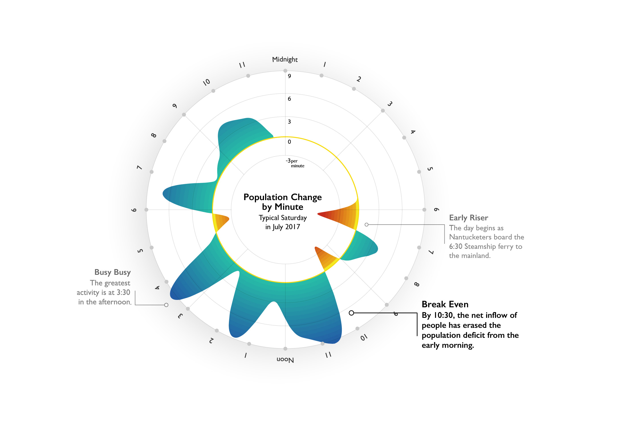
This visualization illustrates the ebb and flow of the island population on an average Saturday in July 2017, incorporating mobility data, ferries, and planes.

Click image to open dashboard

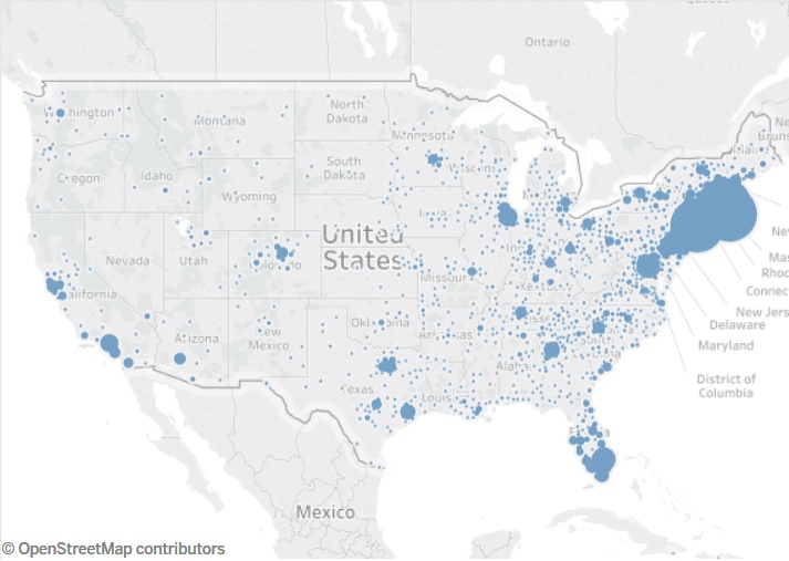
Origin of Visitors, Comparing 2017 and 2018

This dashboard shows the neighborhoods where Nantucket visitors live. You can compare 2017 to 2018 by toggling that option under Year of Visit. The source data comes from location based apps on mobile devices.

NDP’s “Making It Count” Event at the Dreamland

Check out the full video of our “Making It Count” event at the Dreamland where we unveiled the Effective Population Study on July 17th, 2018

Click image to watch video

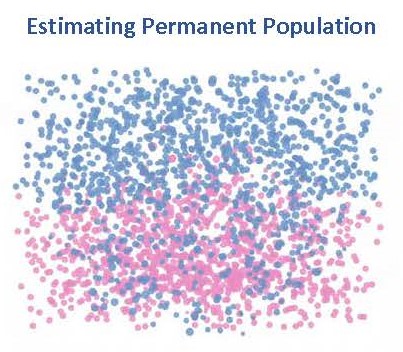
Permanent Population

We estimated Nantucket’s permanent population by asking Civis Analytics to look into its database of 251 million American adults.  We developed a “Permanent Resident Filter” with the goal of determining high confidence permanent residents.

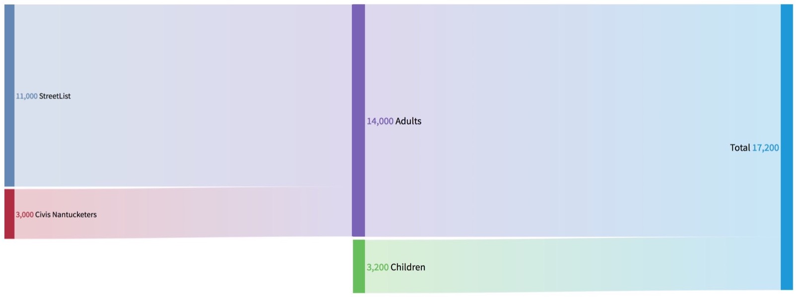
We then compared this list to the Town of Nantucket’s Street List.  We identified 11,000 duplicates and 3,000 “Civis Nantucketers.”  Through detailed demographic estimation methods it was estimated 3,200 children are permanent residents of Nantucket.

Click image to watch video

Permanent Population Simplified

In this Sankey Flow chart, it’s easy to understand the process of deriving estimates of adults from the town Street list and the Civis Database, calculating the number of children, and then adding those three groups together.

Click image to see chart

Effective Population

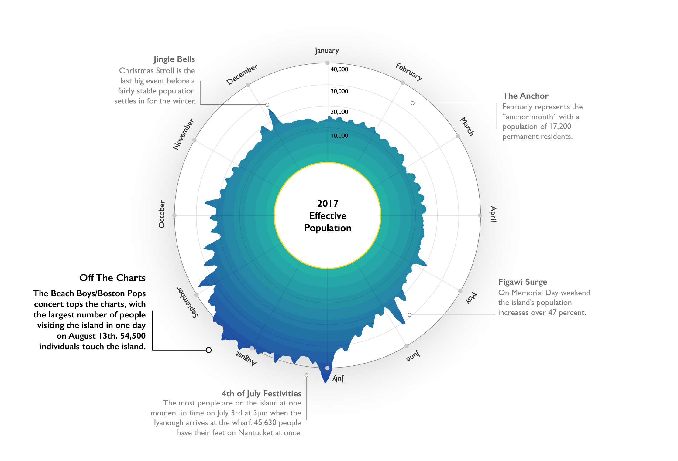
The effective population uses trip level data from ferries, daily airline estimates, and private transportation estimates of people arriving by boat and planes of their own. By aggregating all of these resources, we were able to estimate population on a daily basis.
Click image to see chart

High Season

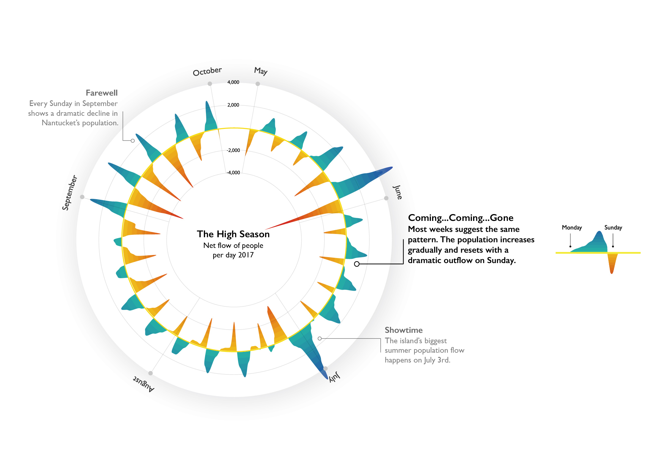
Understanding that that high season drives much of the island’s economic activity, we focused on the May to October period for 2017.  In this chart we looked at the “Net flow of people per day.”

Click image to watch video

Population by Minute

Because of the granularity of our data we were able to look at a typical Saturday in July and track how many people were coming or going by minute.

Click image to watch video

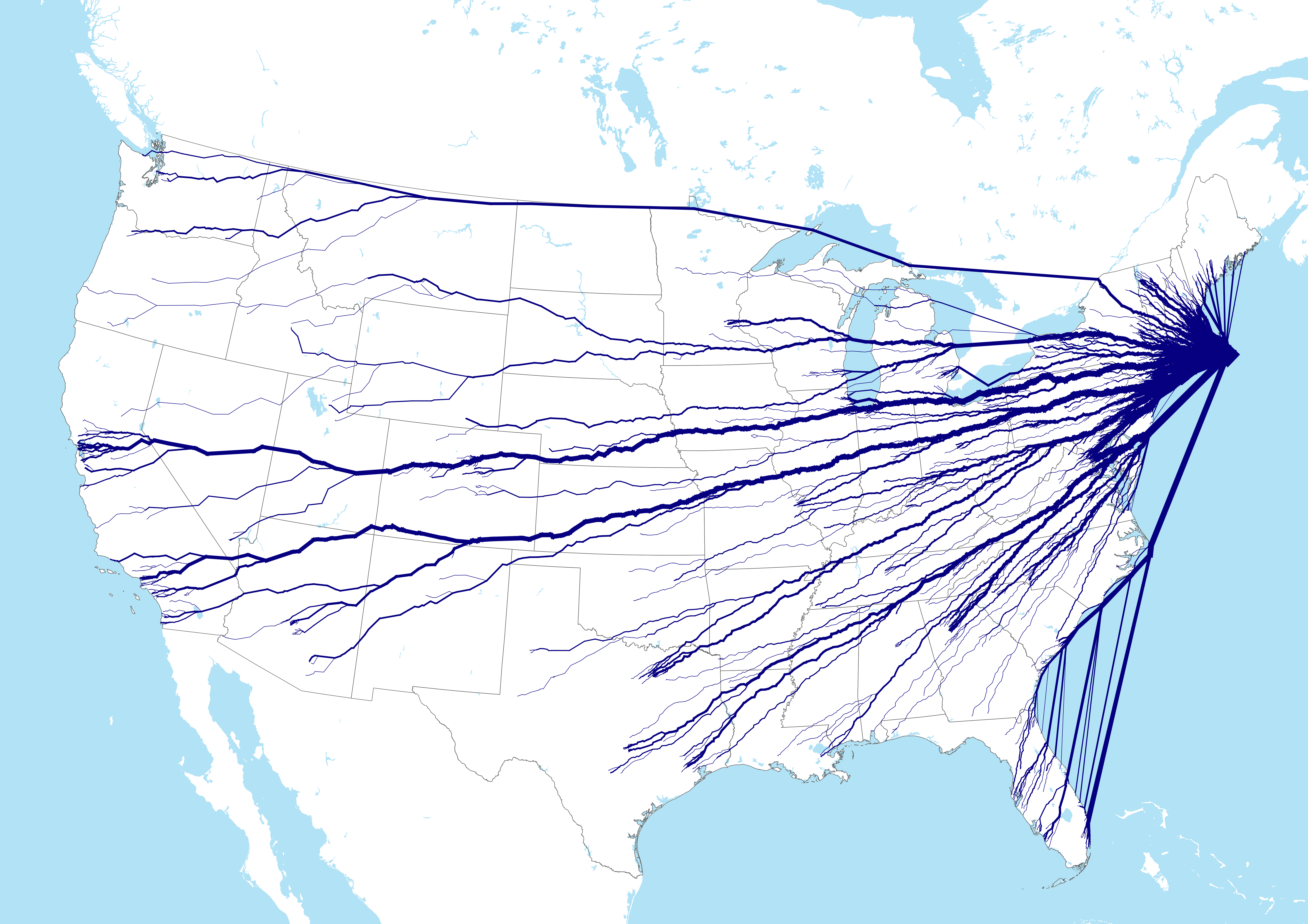
Visitor Origin

In this graphic image we think of travel as a tree with various branches growing from the source – Nantucket.  This data represents visitor origins of a typical Saturday in July.

Click image to watch video

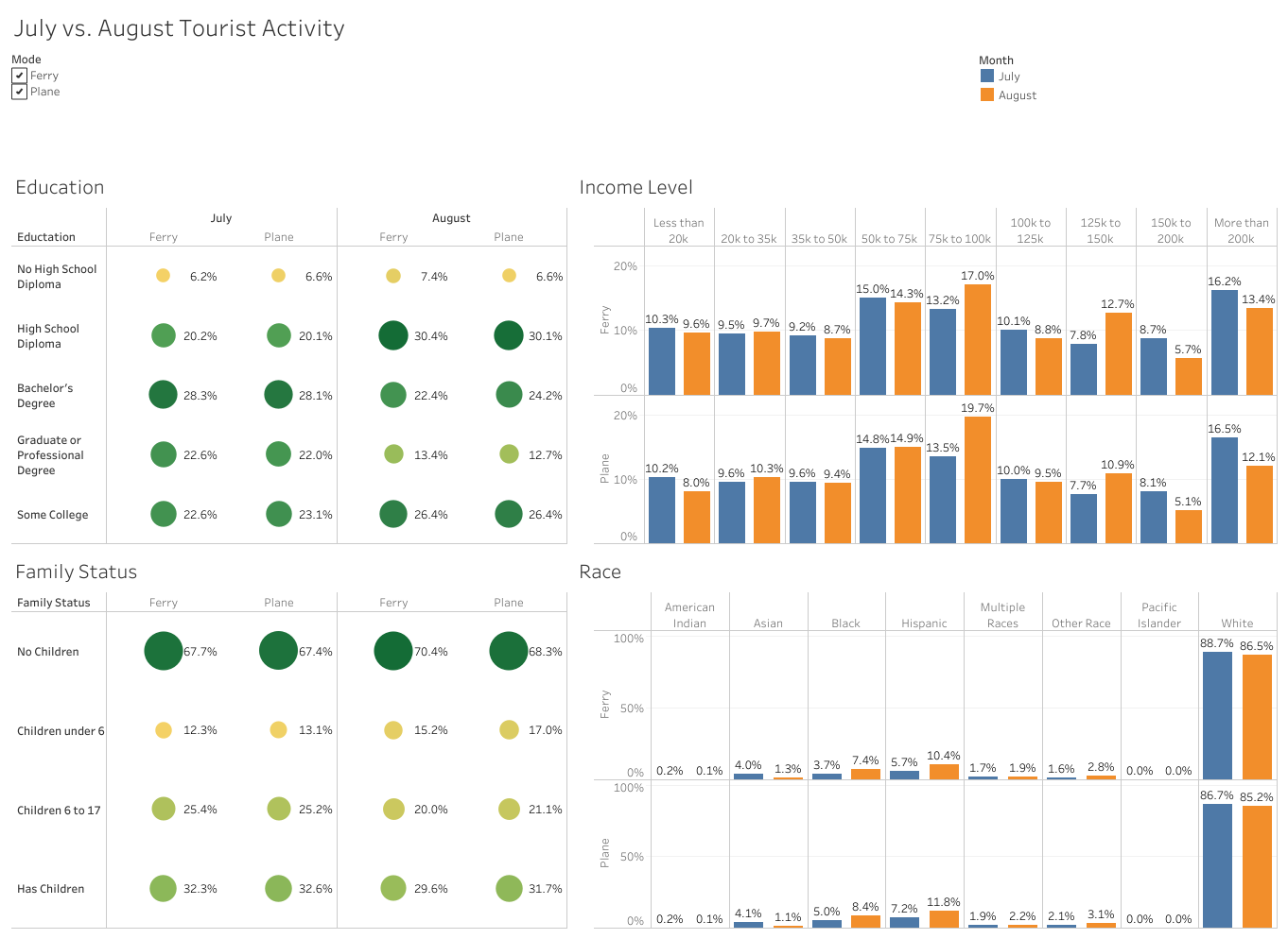
Visitor Demographics

In this dashboard you can see typical demographics for summer 2017 visitors.

Click image to watch video

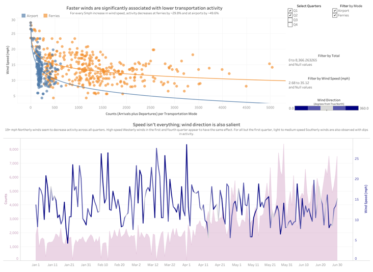
Weather

These charts illustrate the effect of weather on transportation patterns.

Click image to watch video

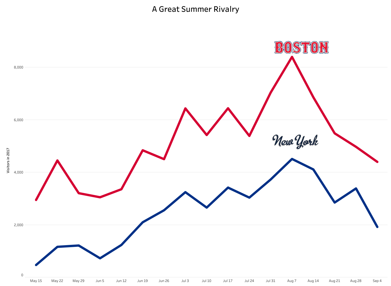
Summer Patterns

For decades it has been said that in August there are more New Yorkers on-island than Bostonians.  While New Yorkers have their highest population on-island in early August, in fact, Bostonians often are twice as common as New Yorkers.

Click image to watch video

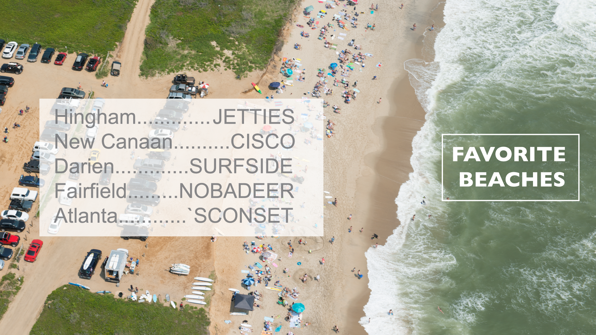
Favorite Beaches

By using anonymized mobility data NDP can understand the home location of island visitors.

Click image to watch video

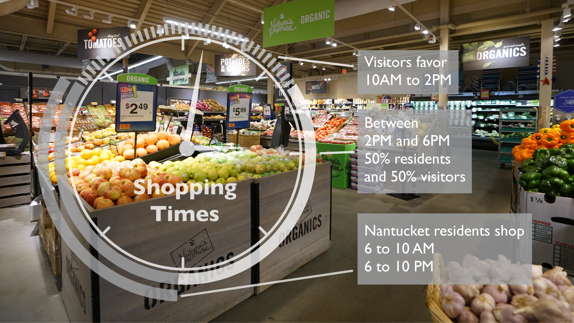
Shopping Patterns

Using anonymized mobility data NDP determined when people shop at the mid-island Stop & Shop.